


The Right WordPress Font Can Make Your Website Feel More Professional
Most website owners spend hours choosing colours and images but give fonts almost no thought. That’s a mistake. The font you choose shapes how visitors read your content, how long they stay, and whether they trust your business enough to get in touch.
The right font does quiet but important work. It guides the reader’s eye, supports your brand, and makes your content easier to absorb. The incorrect one can make even a well-designed website seem unprofessional.
This guide explains web fonts, the main font types and when to use them, how to change fonts in WordPress, and what to avoid so that your site is fast, readable, and on-brand.
KEY TAKEAWAYS
- Fonts affect how visitors read, trust, and engage with your website before they’ve read a single word.
- Web fonts load from the internet, so every visitor sees the same font regardless of their device.
- The font type you choose should match your business context and audience expectations.
- The method you use to change fonts in WordPress depends on your theme and technical comfort level.
- Loading too many fonts or unnecessary font weights will slow your site down.
- Consistent typography across every page builds a more professional and credible website.
TABLE OF CONTENTS
Why Fonts Matter More Than Most Website Owners Realise
Visitors form an opinion about your website within seconds. WordPress typography is a big part of that first impression, even if people aren’t consciously thinking about it. Before a visitor reads a single word, the font you’ve chosen has already told them something about your business.
Poor typography makes content harder to read, and when reading seems like effort, people leave. A font that’s too small, too decorative, or too tightly spaced pushes visitors away before they’ve had a chance to find out what you’re offering.
Typography also affects trust. Visitors judge a business by how its website looks, and a font that feels off can raise doubts before they’ve read a word about your products and services. These might be excellent, but a sloppy-looking website makes it a harder sell.
This extends to every part of your site. A call to action that’s hard to read will be ignored. A product page with inconsistent or cramped text loses the sale. A cluttered contact form makes visitors think twice before filling it in.
For South African businesses competing online, this matters more than ever. Customers have plenty of options, and a website that seems credible and easy to use offers a real advantage. That credibility starts with solid foundations, including reliable web hosting for small business websites and a design that works as hard as you do.

What Are Web Fonts?
Web fonts are fonts that load from the internet rather than from a visitor’s device. When someone opens your website, their browser fetches the font file and uses it to display your text.
This means every visitor sees the same font, regardless of what fonts are installed on their device, and whether they’re on a laptop in Cape Town or a phone in Polokwane.
This is what makes web fonts different from system fonts:
- System fonts, like Arial or Times New Roman, are pre-installed on most computers and phones. They are reliable but limited.
- Web fonts provide a much wider range of choices and far more control over how your brand looks across devices.
Google Fonts is the most widely used source for free web fonts, and it integrates easily with most WordPress setups. But it isn’t the only option.
Adobe Fonts offers a premium library with high-quality typefaces suited to more design-focused projects. Font Squirrel provides free, commercially licensed fonts that you can download and self-host, which can be a better choice for performance.
The Main Types of Fonts Used on WordPress Websites
WordPress website design provides access to a wide range of font categories. Knowing what each one is built for makes it easier to choose the right fit for your site.
Serif Fonts
Serif fonts have small decorative strokes at the ends of each letter. That detail gives them a formal, traditional feel that works well in professional contexts.
Georgia and Times New Roman are common examples. If you’re running a law firm, accounting practice, or financial advisory business, a serif font signals authority and credibility without saying a word.
Sans-Serif Fonts
Sans-serif fonts drop those decorative strokes, which makes them cleaner and easier to read on screens. Open Sans and Helvetica are widely used examples.
They suit almost any type of website, from small business service pages to ecommerce stores, and are the most practical choice for body copy. If you’re unsure where to start with WordPress website design, a well-chosen sans-serif font is usually the right call.
Script Fonts
Script fonts mimic handwriting or calligraphy. They can add warmth and personality to a brand, but they have a clear limitation: they are difficult to read in small sizes.
That makes them a poor choice for body copy or anything a visitor needs to read quickly. Use them sparingly, if at all, and keep them for logos, short headings, or decorative accents where legibility isn’t a concern.
Monospace Fonts
In a monospace font, every character takes up the same amount of horizontal space. Courier and Consolas are well-known examples.
They aren’t designed for general website copy, but they are the standard choice for displaying code, technical documentation, or command-line instructions. If you’re building a developer tool, a SaaS product, or a technical blog, monospace fonts serve a clear and practical purpose.
Display Fonts
Display fonts are designed to grab attention. They are bold, distinctive, and built for large sizes, which makes them effective for hero headings, campaign banners, and key landing page statements. In smaller sizes or in long blocks of text, they quickly become difficult to read. Use them for impact in one or two places and use a cleaner font for everything else.
How WordPress Lets You Change Fonts
There’s no single way to change fonts in WordPress. The method that works for you depends on which theme you’re using, whether you’re working with the Classic Editor or the Block Editor, and how comfortable you are with code.
Some methods change fonts across your entire site in one go; others let you adjust typography on a single page or block without changing anything else.
Understanding that difference matters before you start. A global font change updates every page that shares the same template or stylesheet. A page-specific change only affects the content you have selected. Knowing which one you need saves time and avoids unintended changes elsewhere on your site.
Theme Customiser
The Theme Customiser is the most straightforward option for anyone who isn’t comfortable with code. Most classic WordPress themes (e.g., Astra) include typography controls built into the customiser, which you can access by following these steps:
- Login to your WordPress dashboard.
- Navigate to Appearance → Customise → Global → Typography.
- From there, you’ll typically find options to change the font family, adjust the size, set the font weight, and control line height for different parts of your site, including headings, body text, and menus. Any changes you make here apply globally.
- Once done, click Publish to make the changes live.
The customiser also shows a live preview as you make changes, so you can see exactly how a font looks on your site before saving anything.

IMPORTANT:
If you don’t find the Customise option under Appearance, you can force WordPress to open the traditional Customiser by manually typing /wp-admin/customise.php at the end of your website’s domain name. For example: https://yourwebsite.com/wp-admin/customise.php.
Full Site Editing & Block Themes
If you’re using a block-compatible theme, Full Site Editing offers more control over your site’s typography than the classic customiser does. To access it, go to Appearance → Editor in your WordPress dashboard, then navigate to Styles → Typography → FONTS → Manage fonts.
From here, you can choose your desired font from the library, upload custom fonts, or connect to Google Fonts for easy access.

It’s worth noting that Full Site Editing is only available with block-based themes. If you’re still using a classic theme, you won’t see Editor under Appearance, and you’ll need to use the Theme Customiser instead.
IMPORTANT:
This method allows users to browse and download customer fonts without installing any third-party plugins. Most importantly, it downloads the font files directly to your hosting server (wp-content/uploads/fonts/), which means the visitors’ browsers don’t need to make external requests to Google’s servers. This reduces Time to First Byte (TTFB) and keeps your site compliant with privacy regulations, including POPIA and GDPR.
Gutenberg Block Editor
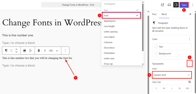
Sometimes you don’t need to change fonts across your whole site. You may want a specific heading or paragraph to look different from the rest of the page. That’s where the Gutenberg Block Editor comes in. Here’s how to use this editor to change fonts in WordPress:
- Click directly on the block you wish to customise. This ensures you are editing the specific block’s settings rather than the post settings.
- Navigate to the right-hand sidebar under Block. Locate Typography and click the three vertical dots.
- From the dropdown menu that appears, click Font. This will toggle the individual font family selection tool into your Typography sidebar panel.
- Once enabled, a new FONT dropdown option will appear directly in your Typography sidebar. Click this and choose your desired typeface from the list to update your text.
- Then, click Save to apply the changes.
From here, you can also adjust the font family, size, weight, and line height for that specific block only. The change stays contained to what you have selected and doesn’t affect anything else on your site.
This is a useful option for one-off adjustments, but it isn’t a replacement for a global WordPress font setup. If you’re changing fonts block by block across multiple pages, you’ll end up with an inconsistent look that’s difficult to manage. Use this method for exceptions, not as your primary approach.
Font Plugins
If your theme’s built-in font options seem limited, a font plugin provides access to a much wider selection without touching any code. Most font plugins connect directly to Google Fonts, providing hundreds of typefaces you can browse and apply from your WordPress dashboard. Some plugins also support custom font uploads or additional font libraries beyond Google Fonts.
This makes them a practical choice for non-technical users who want more control over their site’s typography. Installation is straightforward, and most plugins allow you to assign different fonts to headings, body text, buttons, and menus from a single settings panel.
One thing you need to be careful about: not all plugins are equally well-maintained. Before installing anything, check that the plugin is regularly updated, has a solid number of active installations, and comes with decent reviews. An outdated plugin can create compatibility issues or, worse, introduce security vulnerabilities into your site.
For this section, we’ll use Fonts Plugin | Google Fonts, Adobe Fonts and Upload Fonts:
- Navigate to Plugins → Add New in your WordPress dashboard, search for Fonts Plugin, click Install Now, and then click Activate.
- Go to Appearance → Customise to open the traditional WordPress Customiser interface.
- Click the newly added Fonts Plugin section in the left-hand Customiser sidebar menu.

- Select Basic Settings to change the font for your entire website or choose Advanced Settings to target specific elements such as headers, body text, navigation menus, or buttons.
- Click the specific element you wish to modify (for example, Base Typography for main paragraph text or Headings Typography for titles).
- Open the Font Family dropdown menu and select your desired typeface from the list of available fonts.
- Click the Blue Slider Icon to customise additional typography options, such as Font Weight (boldness) and Font Style.
- Verify how the new text styles look in the real-time preview panel on the right side of your screen.
- Click Publish in the top-left corner of the Customiser sidebar to save your settings and apply the font changes across your live website.

Manual Custom Font Setup
Manual font setup provides the most control of any method, but it does require a bit more technical know-how than the other options.
The simplest manual approach works in both Classic and Block themes:
- Go to WordPress Dashboard → Appearance → Fonts → Upload.
- Upload your font files (preferably .woff2 format) directly.
- Once uploaded, the font is visible under Library → CUSTOM, and available to use across your site without writing or updating any code.
- To use it on your pages and posts:
- Click > (right-arrow).
- Check Select all.
- Click Update.

For developers who need more precise control, the process goes deeper.
For Classic themes, the process involves:
- Uploading your font files to the theme directory.
- Registering the font in your child theme’s functions.php file using wp_enqueue_style.
- And then applying it through CSS using the font-family property.
For block-based FSE themes, fonts are registered instead through the theme.json file, which controls typography settings at the theme level.
No matter the approach you use, always work inside a child theme rather than editing the parent theme’s files directly. If you edit the parent theme and it receives an update, your changes will be overwritten. A child theme keeps your customisations separate and safe.
The method of working with theme files suits developers who require precise control over how custom fonts WordPress loads and renders across their site. It’s also a better fit for more complex or custom-built WordPress environments, where a standard plugin may not offer the flexibility required.
If that sounds like your setup, VPS hosting for developers and custom WordPress sites offers the server-level control to match.
Choosing Fonts for a South African Business Website
The font that works for one business won’t necessarily work for another. Your choice should reflect what your business does, who your audience is, and the level of trust you need to establish before a visitor acts.
- A law firm or accounting practice needs to project credibility and authority. A clean serif or neutral sans-serif communicates professionalism without trying too hard.
- A creative agency or lifestyle brand has more room to experiment with personality, and a distinctive font can become part of what makes the brand recognisable.
- An ecommerce store has a different priority altogether: legibility. Product descriptions, pricing, and checkout text need to be easy to read at a glance, especially on a small screen.
- A developer-focused SaaS product tends to suit cleaner, more technical typography that reflects the nature of the product itself.
South African audiences are diverse and browse on a wide range of devices. A font that looks good on a desktop monitor can become cramped and difficult to read on a budget Android phone with a smaller screen. Whatever font you choose, test it on mobile before you commit.
If you’re still in the early stages of getting your business online, start with the basics first. Register a domain for your website and set up hosting before spending time on typography decisions. A strong foundation makes everything else easier to build on.

Fonts, Readability, & Mobile Experience
A significant portion of South African website visitors browse on mobile, and that number continues to grow. If your typography isn’t optimised for smaller screens, you’re likely losing visitors who may have become customers.
Font Size
Font size is the most obvious factor. A body font size of 16px is the widely accepted minimum for comfortable reading on a screen. Anything smaller forces visitors to zoom in, and most won’t bother.
Line Height
Line height matters just as much. Text that is too tightly packed looks dense and is tiring to read. A line height of around 1.5 to 1.6 times the font size gives each line enough breathing room to feel comfortable.
Letter Spacing & Contrast
Letter spacing and contrast round out the picture. Text that blends into the background, whether because the colour difference is too subtle, or the font weight is too light, puts unnecessary strain on the reader. This is especially noticeable on mobile screens in bright sunlight, which is a very real browsing condition for many South African users.
It’s also worth remembering that a font that looks clean and well-spaced on a desktop can be tiny and difficult to navigate on a phone. Always test your font choices on an actual mobile device, not just by resizing your browser window, before you settle on anything.
Fonts & Website Performance
Fonts directly impact how quickly your WordPress site loads. Every font file your site requests adds to the total page weight, and that cost adds up quickly when you’re loading multiple typefaces, weights, and styles at once.
The simplest way to keep things lean is to load only the font weights you use. If your site only needs regular and bold, there’s no reason to load thin, light, medium, semi-bold, and black as well. Most font services let you select specific weights before generating the embed code, so there’s no excuse for loading more than you need.
Limiting your font choices to one or two typefaces also helps. Beyond the WordPress performance benefit, fewer fonts tend to produce a cleaner, more consistent design.
If you wish to use external font services, it’s worth understanding how they work. When a visitor loads your site, and you’re using Google Fonts, their browser must make a separate request to Google’s servers to fetch the font file. That extra network request adds latency, which is particularly noticeable for visitors on slower mobile data connections.
Self-hosting your fonts, by uploading the font files directly to your server and serving them from your own domain, removes that dependency and gives you more control over load speed.
Font optimisation is one piece of the performance puzzle, but it works best when combined with everything else. Reliable, fast WordPress hosting in South Africa means your site’s files are served from infrastructure built for local users, which makes a measurable difference to load times regardless of how well your fonts are optimised.
Accessibility Considerations for WordPress Typography
Good typography isn’t just about aesthetics; it’s about ensuring every visitor can comfortably read your content, including those with visual impairments, attention difficulties, or reading challenges.
- Font size is the starting point. Body text should be large enough to read without zooming, with 16px being the accepted minimum.
- Contrast matters just as much. Light grey text on a white background may look elegant in a design mockup, but it’s genuinely difficult to read for many users. The Web Content Accessibility Guidelines recommend a contrast ratio of at least 4.5:1 for normal body text.
- Decorative and script fonts should stay out of your body copy entirely. They are hard enough to read in short bursts, let alone across full paragraphs.
- Line spacing and paragraph spacing also deserve attention. Tight text feels claustrophobic and discourages reading. Giving your text room to breathe makes it easier to scan, easier to follow, and more welcoming for those users who process written content more slowly.
Clear, well-spaced typography benefits everyone, not just users with specific needs. It’s one of the simplest ways to make your website more inclusive without any technical complexity.
Brand Consistency Across Your Website
Your website’s typography should follow a clear, consistent system across every page. That means your headings, body copy, buttons, menus, and form labels all use the same fonts in identical weights, applied consistently throughout.
When fonts vary from page to page, or when different blocks use different typefaces without a clear reason, the site starts to feel disjointed. Visitors may not be able to explain why it feels off, but they notice. Consistency signals that someone has thought carefully about the site, and that type of attention to detail shows professionalism and builds trust.
A consistent typography system is also easier to maintain. When you decide to update your font choices later, a well-structured setup means you can change them in one place, and they update everywhere. Applying fonts block by block across dozens of pages creates a maintenance problem that compounds over time.
Brand consistency also extends beyond your website. The same care you put into your site’s typography should carry through to your email communication. Professional email hosting for your business ensures your emails look as professional and on brand as the website your customers just visited.

Common Font Mistakes on WordPress Websites
Most font problems on WordPress sites come down to a handful of avoidable decisions. Here’s what to watch out for:
- Too many fonts create visual noise. Stick to two typefaces at most, one for headings and one for body copy.
- Decorative fonts in body copy kill readability. Script and display fonts belong in short headings, not paragraphs.
- Skipping mobile testing is a costly oversight. A font that looks clean on a desktop can become unreadable on a phone.
- Loading unnecessary font weights slows your site down. Only load the weights your design uses.
- Low contrast between text and background makes content hard to read for everyone. If your text doesn’t stand out clearly, fix it.
- Changing fonts page by page without a plan breaks visual consistency and creates a maintenance problem. Set your typography globally from the start.
South African Hosting & Performance Considerations
Font optimisation doesn’t work in isolation. It’s one part of a broader performance picture that includes your hosting environment, caching setup, and image optimisation. Get all those correct, and your site loads quickly. However, if you neglect any one of them, even a perfectly optimised font setup won’t save your load times.
South African users access websites on a wide range of devices and network conditions. Many browse using mobile data rather than fixed broadband, and connectivity isn’t always consistent. A website that loads reliably under those conditions keeps customers engaged. One that doesn’t will lose them to a competitor whose site works better on a slow connection.
A professional, trustworthy website also needs the proper security foundations in place. Design and performance matter, but so does ensuring your visitors feel safe. Secure your website with SSL to protect the data passing between your site and your visitors, and to show them that your business takes their security seriously.

POPIA, Trust, & Website Design
Typography is a design choice, but it has practical implications for how users engage with the parts of your site that matter most legally. Under the Protection of Personal Information (Act POPI Act), South African websites that collect personal information must be transparent about how that data is used. That transparency only works if users can read and understand what you’re telling them.
A privacy notice set in a small, low-contrast font is easy to overlook. An opt-in form with cramped, hard-to-read text creates confusion rather than informed consent. If your cookie consent banner is styled in a decorative font that’s difficult to read quickly, users will dismiss it without reading it. None of that serves your business or your visitors well.
IMPORTANT:
This isn’t legal advice, and POPIA compliance involves far more than font choices. But clear, readable typography on your forms, notices, and consent text is a straightforward step that supports trust. If you’re unsure how to approach the design side of compliance-related content on your site, Domains.co.za support can point you in the right direction.
When to Ask a Developer for Help
Not every font change requires a developer. The Theme Customiser, Full Site Editor, and font plugins are all designed for non-technical users, and most business owners can handle those without any coding knowledge.
A developer is necessary when standard methods don’t give you what you need.
For example:
- Registering custom fonts that WordPress doesn’t recognise by default.
- Editing the theme.json file.
- Modifying a child theme.
- Writing custom CSS requires a level of technical confidence that goes beyond point-and-click.
Doing these incorrectly can break your site’s layout or cause fonts to stop loading entirely.
If you’re running a more complex or custom-built WordPress site, it’s worth involving a developer from the start rather than trying to reverse engineer a problem after the fact.
Final Thoughts: Better Fonts Create a Better Website Experience
Fonts are easy to overlook when you’re focused on taking a website live, but they do more quiet work than most people realise. The correct WordPress fonts, applied consistently and optimised for performance, make your content easier to read, your brand more recognisable, and your site more credible to every visitor who lands on it.
Typography affects readability, trust, mobile experience, page speed, and user engagement across everything from your product pages to your privacy notice. That’s a lot of influence for something most visitors never consciously notice. So, ensure you get your fonts right.
A well-chosen font deserves a website that performs just as well behind the scenes. Domains.co.za WordPress Hosting gives South African businesses a fast, secure, and reliable foundation to build on, so your website looks professional and loads quickly for every visitor, wherever they are.
![Strip Banner Text - Get your WordPress site running on hosting that's optimised for local performance. [Learn More]](/articles/wp-content/uploads/2026/07/change-fonts-in-wordpress-02.webp "Get your WordPress site running on hosting that's optimised for local performance. [Learn More]")
Power Up Your Site: How to Install a WordPress Plugin
VIDEO: Power Up Your Site: How to Install a WordPress Plugin
FAQS
Can I change fonts in WordPress without touching any code?
Yes. The Theme Customiser, Full Site Editor, and Font menu, and font plugins, all allow you to change fonts without writing a single line of code. These are the best starting points for non-technical users.
What’s the difference between a global font change and a page-specific one?
A global font change updates typography across your entire site. A page-specific change only affects the block or page you’ve selected. Use the Theme Customiser or FSE for global changes, and the Gutenberg Block Editor for individual adjustments.
How do I use Google Fonts in WordPress?
You can integrate Google Fonts through a Fonts menu or a font plugin, by adding the embed code to your child theme’s functions.php file, or by registering the font through theme.json in FSE themes. Many themes, like Astra, also include built-in support for Google Fonts in their typography settings.
What font formats does WordPress support?
WordPress supports .woff, .woff2, .ttf, and .otf font formats. For web use, .woff2 is generally recommended as it offers the best compression and browser support.
How many fonts should I use on my WordPress website?
WordPress supports .woff, .woff2, .ttf, and .otf font formats. For web use, .woff2 is generally recommended as it offers the best compression and browser support.
Will adding custom fonts slow down my website?
It can, if you load too many font files or unnecessary weights. Keep your font selection lean, load only the weights you use, and consider self-hosting your fonts rather than relying on external servers to reduce the performance impact.
Do I need a child theme to add fonts manually?
Yes, if you’re editing theme files directly. Without a child theme, your changes will be overwritten the next time your theme updates. A child theme keeps your customisations safe.
Can I upload my own font files to WordPress?
Yes. You can do so by going to Appearance → Fonts → Upload in your WordPress dashboard. This works in both Classic and Block themes and requires no coding.
What’s the best font for a South African business website?
There’s no single answer; it depends on your industry and audience. Professional services tend to suit clean serifs or neutral sans-serifs. eCommerce and service businesses generally do well with readable sans-serif fonts. Creative brands have more flexibility.
Does my font choice affect website accessibility?
Yes. Font size, contrast, line spacing, and font style all affect how accessible your content is. Use a minimum body font size of 16px, maintain good contrast between text and background, and avoid decorative fonts for body copy.
Other Blogs of Interest
- 18 Best WordPress Plugins To Make Your Website Fly With Our WordPress Hosting
- WordPress Updates: The First Major Version Release For 2026 Due In April
- Why WordPress and WordPress Hosting are the duo your SME needs in 2024
- The World’s Most Loved CMS – WordPress Celebrates Its 21st Birthday
- Exploring WordPress User Roles: A Practical Guide

Rhett isn’t just a writer at Domains.co.za – he’s our resident WordPress content guru. With over 8 years of experience as a content writer, with a background in copywriting, journalism, research, and SEO, and a passion for websites.
Rhett authors informative blogs and articles that simplify the complexities of WordPress, website builders, domains, and cPanel hosting. Rhett’s clear explanations and practical tips provide valuable resources for anyone wanting to own and build a website. Just don’t ask him about coding before he’s had coffee.