


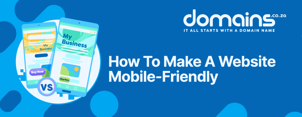
How To Make A Website Mobile-Friendly: Top Tips For A Responsive Website
Read on to learn how to make a website mobile-friendly and why responsiveness matters.
‘How can I make my website mobile-friendly’ is a question every business owner should be asking. Whether you are building a brand-new website or auditing your existing one, it is important to realise that the majority of your visitors won’t be browsing from a desktop but rather from a smartphone. This is because it has become increasingly convenient for modern internet users to search online while they are busy doing other things like running errands, watching television, drinking coffee in bed, etc.
Investing the time and energy to make your website mobile-friendly means you’ve adapted your site in such a way that mobile visitors can access it from any device without frustration. Meaning no irritating pop-ups, text that reads well and pages that load quickly, to highlight just a few features.
Not priortising these aspects won’t just alienate visitors and cause bounce rates to go up, but it will also affect your Search Engine Optimisation (SEO), and cause damage to your brand reputation.
RELATED: Mobile-Friendly Website Creation: 8 Best Practices
KEY TAKEAWAYS
- More than 60% of South Africans now browse the internet on smartphones, making mobile-friendly website design essential for every business.
- Responsive web design automatically adapts your website to different screen sizes using a single website.
- A mobile-friendly website improves user experience, supports SEO, and can help increase enquiries and sales.
- Simple navigation, fast loading pages, readable content, and easy-to-tap (thumb-friendly) buttons all contribute to a better mobile experience.
- Building your website with responsive templates and reliable Web Hosting makes it much easier to create a mobile-friendly website.
TABLE OF CONTENTS
What is a Mobile-Friendly Website?
A mobile-friendly website is a website that has been optimised in such a way that it is easy to access and navigate on varying screen sizes. According to the most recent research from Statcounter, 60.27% of South African browse the internet via smartphones compared to the 39.16% on desktops and 0.56% on tablets. It is therefore critical for business owners to learn how to make a website mobile-friendly.

5 Mobile-Friendly Website Options
There is more than one way to optimise a website for mobile devices. Each approach has its own advantages and disadvantages depending on your business goals, budget, and the complexity of your website.
1. Responsive Design
Responsive design uses a single website that automatically adjusts its layout, images, and content to fit different screen sizes.
Pros
- Recommended by Google.
- One website to manage.
- Better for SEO.
- Lower maintenance costs.
- Consistent user experience across devices.
Cons
- Requires careful planning during the design process.
- Older websites may require redevelopment to become fully responsive.
2. Adaptive Design
Adaptive websites use multiple fixed layouts that are displayed depending on the visitor’s device.
Pros
- Can be highly optimised for specific devices.
- Gives designers greater control over each layout.
Cons
- More expensive to develop.
- Requires multiple layouts to maintain.
- Updating content can become more time-consuming.
3. Mobile-First Design
Rather than designing a website for desktop first, mobile-first design starts with the smallest screen before expanding to larger devices.
Pros
- Prioritises speed and usability.
- Creates cleaner, more focused websites.
- Encourages better performance.
Cons
- May require additional planning for complex desktop features.
- Existing desktop websites often need significant redesigns.
4. Dynamic Serving
Dynamic serving uses one website domain name (URL) but delivers different HTML depending on the visitor’s device.
Pros
- Allows highly customised mobile experiences.
- Can improve performance for specific devices.
Cons
- More technically complex.
- Requires ongoing maintenance.
- Incorrect device detectioncan cause display issues.
5. A Separate Mobile Website
A separate mobile website typically uses a different domain name (URL), such as mybusiness.mobi.
Pros
- Complete control over the mobile experience.
- Useful for very specialised mobile functionality.
Cons
- Two websites to maintain and market.
- Higher development costs.
- Can create SEO challenges if not managed correctly.
- Generally, no longer recommended for most businesses.
7 Benefits of Responsive Web Design
While there are several approaches to creating a mobile-friendly website, responsive web design has become the most popular choice for businesses of all sizes.
Below are some of the key benefits of responsive web design and why it remains the preferred solution for modern websites:

1. Reach More Customers
One of the biggest benefits of responsive web design is that your website becomes accessible to anyone, regardless of the device they’re using. With most South Africans browsing on smartphones, you’re opening your business to a much larger audience while reducing the chances of visitors leaving because your website doesn’t display correctly.
2. Deliver A Better User Experience
Visitors expect websites to be easy to use. Responsive websites automatically adjust images, menus, text and buttons, so users don’t have to zoom in, scroll sideways, or struggle to find what they need. A smoother browsing experience keeps visitors engaged for longer.
3. Improve Website Performance
Responsive websites are typically faster and more efficient because they are designed with performance in mind. Combined with reliable, high-speed Web Hosting, your pages can load quickly, improving both customer satisfaction and search engine rankings.
4. Save Time and Money
Managing one responsive website is far easier than maintaining a separate desktop and mobile version. Updates only need to be made once, reducing maintenance costs while ensuring your branding and content remain consistent across every device.
5. Boost Your SEO
Google uses mobile-first indexing, meaning it primarily evaluates the mobile version of your website when determining search rankings. A responsive website improves usability, page speed and accessibility – all factors that can positively influence your SEO performance.
6. Improve Accessibility
Responsive websites make it easier for everyone to browse content. Larger text, properly spaced buttons, logical layouts and clear navigation all help visitors access your information more comfortably, regardless of the device they’re using.
7. Increase Engagement and Conversions
When visitors can easily navigate your website, complete forms and click your call-to-action buttons, they’re far more likely to stay on your site and take action. Whether your goal is enquiries, bookings or online sales, a mobile-friendly website removes unnecessary friction from the customer journey.
How to Make a Website Mobile-Friendly:
Creating a responsive website isn’t just about shrinking your desktop website to fit a smaller screen. Good mobile friendly website design is intentional and considers how people actually browse on their phones. They’re often on the move, using one hand, dealing with distractions and expecting to
Step 1: Start With a Responsive Website Design
The easiest way to create a mobile-friendly website is to begin with a responsive layout. Responsive websites automatically resize content, images and navigation to suit every screen size, providing a consistent experience whether someone visits from a desktop, tablet or smartphone.
If you’re building a website from scratch, our AI Website Builder makes the process simple with more than 200 professionally designed responsive templates that automatically adapt to different devices, helping you launch a mobile-ready website in less time.
A responsive template gives you a strong foundation by automatically adapting your website to different screen sizes. However, creating a truly mobile-friendly website doesn’t stop there. The following steps will help you refine the mobile experience so visitors can browse, navigate and interact with your website more easily.
RELATED: Website Builder vs WordPress: Which Is Best For Your New Business?
Step 2: Keep Your Design Simple and Easy to Navigate
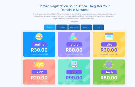
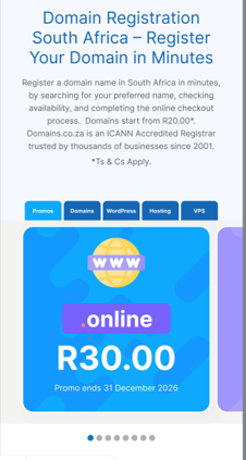
Mobile screens have limited space, so every element should have a purpose. Avoid cluttering by simplifying your layout, removing unnecessary pop-ups, and focusing on the information visitors are most likely looking for.
Your navigation should be clear and intuitive, with well-organised menus, search functionality where appropriate, and content grouped into logical sections using tabs or accordions. The fewer taps it takes for someone to find what they need, the better their experience will be.
Step 3: Make Your Content Easy to Read
Reading long paragraphs on a phone can quickly become frustrating. Break up your content using clear headings, shorter paragraphs and concise copy that gets straight to the point. Where appropriate, use expandable sections so visitors can choose whether to read additional information without feeling overwhelmed.
Large, legible fonts with sufficient spacing between lines also makes your content much easier to consume on smaller screens.
Step 4: Design For Touchscreens
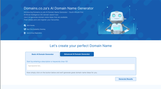
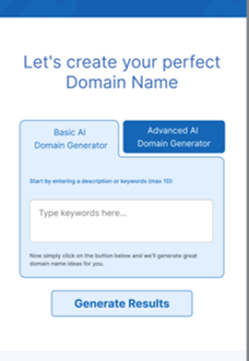
Unlike desktop users, mobile visitors navigate with their fingers rather than a mouse. Buttons should be large enough to comfortably tap, links should have enough spacing between them to prevent accidental clicks, and call-to-action buttons should stand out clearly with concise, action-oriented wording.
Simple design adjustments like these can significantly improve usability and encourage more conversions.
Step 5: Optimise Images and Improve Website Speed
Website speed plays a major role in both user experience and SEO. Compress images before uploading them, avoid unnecessarily large media files and embed videos from third-party platforms rather than hosting them directly on your website wherever possible.
Your choice of hosting and hosting provider also plays an important role. Fast, reliable Web Hosting from Domains.co.za will help your pages load quickly, even during busy periods, reducing bounce rates and creating a smoother browsing experience for your visitors.
Step 6: Build Using Modern Web Standards
Using modern technologies such as HTML5 helps ensure your website remains compatible across today’s browsers and devices. Modern coding practices also improve accessibility, performance, and long-term maintainability while reducing reliance on outdated technologies.
Step 7: Keep Forms Short and Simple
Long forms can discourage mobile users from completing enquiries or purchases. Only ask for the information you genuinely need, minimise the number of fields, and make it easy for users to complete forms using their mobile keyboard. The quicker visitors can submit a form, the more likely they are to do so.
Step 8: Test Your Website Regularly
Even the best-designed websites should be tested regularly. Check how your website performs across different smartphones, tablets, and browsers to identify layout issues, slow-loading pages or buttons that are difficult to tap. Tools such as TestGrid can help you identify problems before your customers do.
Learning how to make a website getting your business online.
Whether you’re creating your first website or refreshing an existing one, Domains.co.za has the tools to help you succeed.
RELATED: How To Create A Website To Sell Products Online
![Strip Banner Text -Improve page loading speed by compressing images and choosing the best hosting. [Get Hosting].](/blog/wp-content/uploads/2026/07/mobile-friendly-website-04.webp "Improve page loading speed by compressing images and choosing the best hosting. [Get Hosting]")
How to Choose the Right Web Hosting Plan for Your Website
VIDEO: How to Choose the Right Web Hosting Plan for Your Website
FAQS
What is a mobile-friendly website?
A mobile-friendly website is a website that has been designed to display and function properly on smartphones, tablets, and desktops. It automatically adjusts its layout, text, images, and navigation to provide a seamless browsing experience across different screen sizes.
How can I make my website mobile-friendly?
If you’re wondering how to make a website mobile-friendly, start by using a responsive website design. From there, optimise your navigation, compress images, improve loading speed, simplify forms, make buttons easy to tap and regularly test your website on different devices.
What is the difference between a mobile-friendly website and a responsive website?
A mobile-friendly website is designed to work well on mobile devices, while a responsive website automatically adapts its layout to fit any screen size using a single website. Responsive web design is generally considered the best long-term solution because it provides a consistent user experience across all devices.
Why is responsive web design important?
One of the biggest benefits of responsive web design is that it improves user experience by making websites easier to navigate on any device. It also supports better SEO, reduces maintenance costs, increases accessibility, and helps businesses reach more mobile users.
Does a mobile-friendly website help with SEO?
Yes. Google uses mobile-first indexing, meaning it primarily evaluates the mobile version of your website when determining search rankings. A fast, responsive, and mobile-friendly website can improve user experience and contribute to better SEO performance.
Can I make an existing website mobile-friendly?
Yes. Existing websites can often be updated by implementing a responsive layout, improving navigation, optimising images, simplifying content, and enhancing page speed. However, older websites may require a redesign if they rely on outdated technology or fixed-width layouts.
Do I need coding skills to create a mobile-friendly website?
No. Many website builders make it easy to create a mobile-friendly website without coding. For example, AI-powered website builders with responsive templates automatically adapt to your website for different devices, allowing you to customise your site using simple drag-and-drop tools.
Other Blogs of Interest
- 7 Tips For Optimising Your Ecommerce Website
- How To Future-Proof A Business Website: 7 Essentials
- 4 Best Web Hosting Types For Small Businesses In South Africa
- How To Create A Landing Page That Converts
- How To Create A Responsive Website With Site Builder

Chantél Venter is a creative writer, strategic thinker, and a serious gesticulator. She’s passionate about storytelling, small businesses and bringing color to the world – be it through her words or wardrobe.
She holds a four-year degree in Business and Mass Media Communication and Journalism. She’s been a copywriter and editor for the technology, insurance and architecture industries since 2007 and believes anybody can run a small business successfully. She therefore enjoys finding and sharing the best and most practical tips for this purpose.